Visual Standards
Introduction
True to its mission to be a premier institution of learning in the South, Saint Michael’s College of Laguna adheres to standards of identity that seek to establish a brand that reflects a strong image of the philosophy and core values of the College.
Inspired by the ideals of service to God and country, moral uprightness, commitment to excellence, and love for humanity and intercultural sensitivity, the Michaelean Visual Identity was created to serve as a guide in properly representing the College in various forms of communication.
Proper use of the Emblem
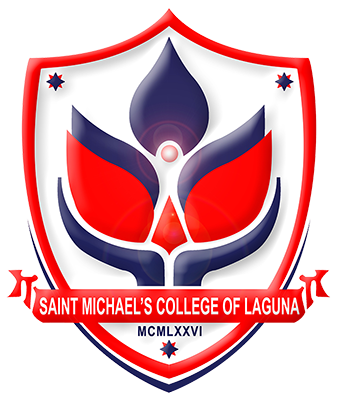
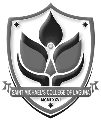
The school emblem was designed to serve as visual reminder of that SMCL stands for. Each and every element of the design echoes as part of the Institution’s commitment to its students, their parents and every member of the community which it has vowed to serve with vigor and enthusiasm.
User may resize the emblem.
• Emblem should not be inverted.
• Emblem should not be misproportioned.
• Emblem should not be redesigned.
EMBLEM MAY BE PRINTED IN COLOR OR IN GRAYSCALE.
Proper
The SMCL Wordmark
The official wordmark system of the College features its name, “Saint Michael’s College of Laguna” using Corbel Bold font. Use the Corbel font only in the wordmark.
The first letters of each word in the nameplate (the acronym SMCL) should be capitalized or uppercase.
The remaining letters must be small capitals (uppercase letters set at the same height and weight of lowercase letters).

For Michaeleans who need to use the wordmark and the emblem in projects and other letters or documents, please show your file to the Institutional Communications Center or the Quality Management System office before printing to prevent non-conformity.


